Colour psychology – branding a horror film

Historically, red and black is a killer combination when it comes to horror film logos and related promotional material. This striking union has been used consistently to create some of the best film branding of our time.

The early 80s saw a run of horror films and start of successful franchises following the success of John Carpenter’s 1978 American slasher film Halloween, starring Jamie Lee Curtis in her film debut.

When creating a brand’s visual identity we ensure consistency and are mindful of its application across various channels and media early on in the development phase. Interestingly, back then, there were several different logotypes used across different promotional material for the same film, in each case the poster visuals and design would also change. Somewhat disjointed to use varying graphic solutions for the same product. Although, was that approach intentionally disjointed to indicate disruption and chaos?

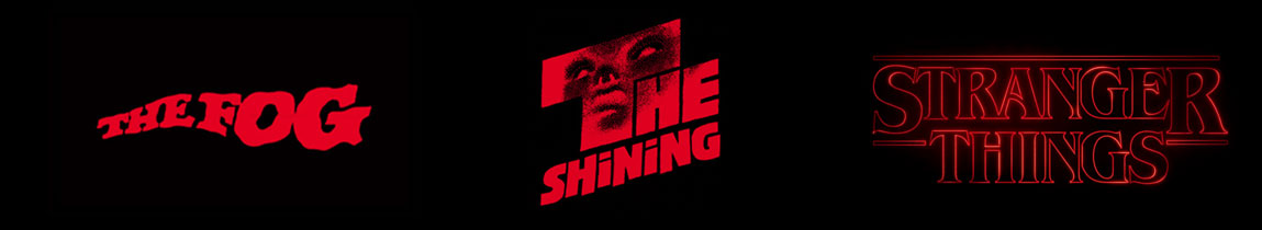
What was commonplace was the applied colour palette of predominantly red and black. From The Fog and The Shining (both 1980), The Blair Witch Project (1999) to the modern day Stranger Things (2016) from Netflix. The logos all used the classic red and black combination to portray the horror of their content.

horrorfilmlogosW
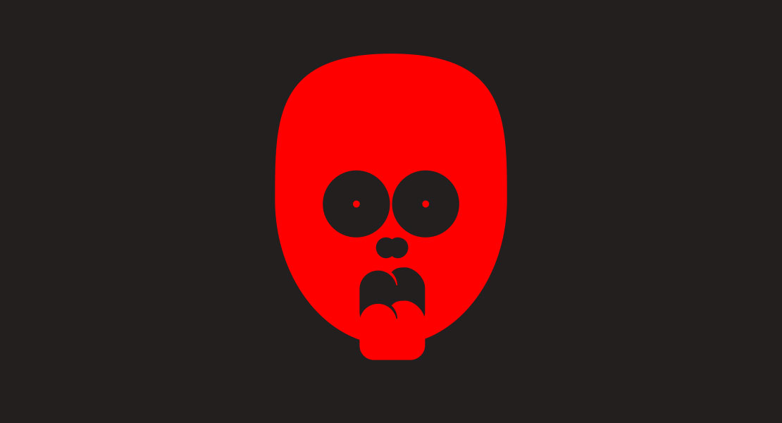
The colour psychology – RED – a hot colour, associated with war, fire, violence but also love, power, and passion. Indicates danger, hence it’s used in warning signs and labels. Used predominantly in its stronger, bolder, darker tones in the horror genre, red can also have a physical effect on individuals, raising the pulse, heart rate, and blood pressure. BLACK – strong, bold and neutral, it’s negative connotations associated with mystery, evil and death being the traditional colour of mourning in the western world. Providing the backdrop to most of these classic horror film logos.

The red and black colour combination coupled with original, distorted typography proved a successful combination in the design of the most well-known film branding. Jagged, fractured, off-centered and blurred edge typography – all disruptive techniques to create an edgy, uneasy feeling. Successfully combining text, colour and graphic elements to subconsciously establish an element of fear for what you were about to witness… boo!

Rebranding a premier identity

After several high profile rebrands lately, we’ll touch on several over a series of these blogs.

First, the new visual identity for the Premier League, which will roll out from the 2016/17 season onwards. It was an opportunity to evolve a brand following the decision to drop the title sponsorship (previously Barclaycard and Carling).

Featuring a redrawn lion icon and new colour palette, interestingly the design agency responsible, DesignStudio, tackled this from a digital and broadcast-first approach “make it work as an app icon, and worry about everything else after”. Possibly that’s becoming the new adage, replacing the ‘it needs to work in mono, as well as full colour’ of old. It’s certainly up there in todays considerations of how and where a logo is to be applied with the digital and social media platforms an all important part of the roll out, for any new visual identity.

For me it reiterates the importance of understanding the requirements and getting the finer detail on what’s required to ultimately meet the brief and ideally surpassing the client’s expectations in the process. With about 600 iterations in the design process for the new Premier League brand, it seems it has been honed to perfection for the client and would have certainly fulfilled the creative brief.

Given the column inches given over to these launches and social media comment on such an issue, it seems everyone these days is visually astute and has an opinion when it comes to rebranding. Everyone’s a critic, but from the graphic designers point of view, if we’ve fulfilled the brief, it works in every conceivable application, represents the brand and what it stands for and the client is happy, job done.

Coffee pods and carrots

Following the release of the 2016 basket of goods and services this week from the Office for National Statistics, a Creative Conduct vector graphic illustrating the recent headlines.

The new basket contains 704 items, of which 15 are new this year. Fourteen items have been removed, while 13 have been modified.

As the take up of coffee machines in the UK households continue, 2016 includes coffee pods, while both organic carrots and organic dessert apples were removed as organic products become mainstream.

Whether analysing data for reporting purposes, illustrating social media messages or to accompany press releases, illustrating content with well-crafted graphics brings your story to life. With an appetite for all things visual, it’s now an essential element to engage with your audience.

The designer’s smile

In times gone by our good old fashioned service with a smile has in recent years been supplemented and, in some cases replaced with a graphic subconscious smile, cleverly integrated to form part of the logo design for these multinational companies.

Amazon subtly takes us from ‘A’ to ‘Z’ while this lengthy grin culminates with the arrowhead reaching its destination and another one of its 304 million happy customers worldwide.

Argos’s corporate identity was designed to reflect the brand’s appeal and customer confidence in the business. Friendly, approachable and dynamic, it positively beams from ear to ear while you wait patiently before making your way to the same collection point as everyone else in the store.

Combining a hand drawn ‘sketchy’ logotype sitting above a jovial somewhat clown-like smile, Hasbro’s brand identity is individual with a sense of fun, putting it firmly within its target market.

Derived from the TUI acronym (formerly Touristik Union International) the graphic device that accompanies the Thomson brand in the UK is more abstract in its form, but a subconscious smile nonetheless. It is more prominent than the typographic element that it combines with, although somewhat disjointed as it is used in isolation on aircraft livery, for example.

When developing a brand identity in a visual world that is increasingly difficult to navigate, clarity is key. Understanding the brand and getting under the skin of the business is important to us. Fact finding then enables us to scope out the possibilities and devise solutions that answer the brief and create a visual identity for your enterprise that provides the foundations for building a successful brand.