


Rebranding a premier identity
After several high profile rebrands lately, we’ll touch on several over a series of these blogs.
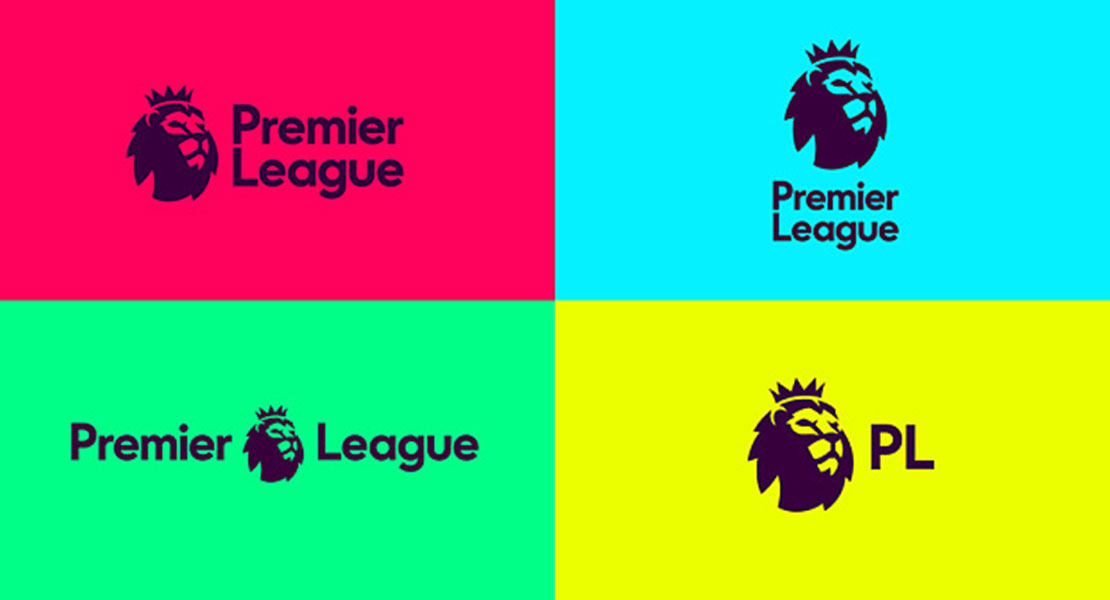
First, the new visual identity for the Premier League, which will roll out from the 2016/17 season onwards. It was an opportunity to evolve a brand following the decision to drop the title sponsorship (previously Barclaycard and Carling).
Featuring a redrawn lion icon and new colour palette, interestingly the design agency responsible, DesignStudio, tackled this from a digital and broadcast-first approach “make it work as an app icon, and worry about everything else after”. Possibly that’s becoming the new adage, replacing the ‘it needs to work in mono, as well as full colour’ of old. It’s certainly up there in todays considerations of how and where a logo is to be applied with the digital and social media platforms an all important part of the roll out, for any new visual identity.
For me it reiterates the importance of understanding the requirements and getting the finer detail on what’s required to ultimately meet the brief and ideally surpassing the client’s expectations in the process. With about 600 iterations in the design process for the new Premier League brand, it seems it has been honed to perfection for the client and would have certainly fulfilled the creative brief.
Given the column inches given over to these launches and social media comment on such an issue, it seems everyone these days is visually astute and has an opinion when it comes to rebranding. Everyone’s a critic, but from the graphic designers point of view, if we’ve fulfilled the brief, it works in every conceivable application, represents the brand and what it stands for and the client is happy, job done.